Pantone Series
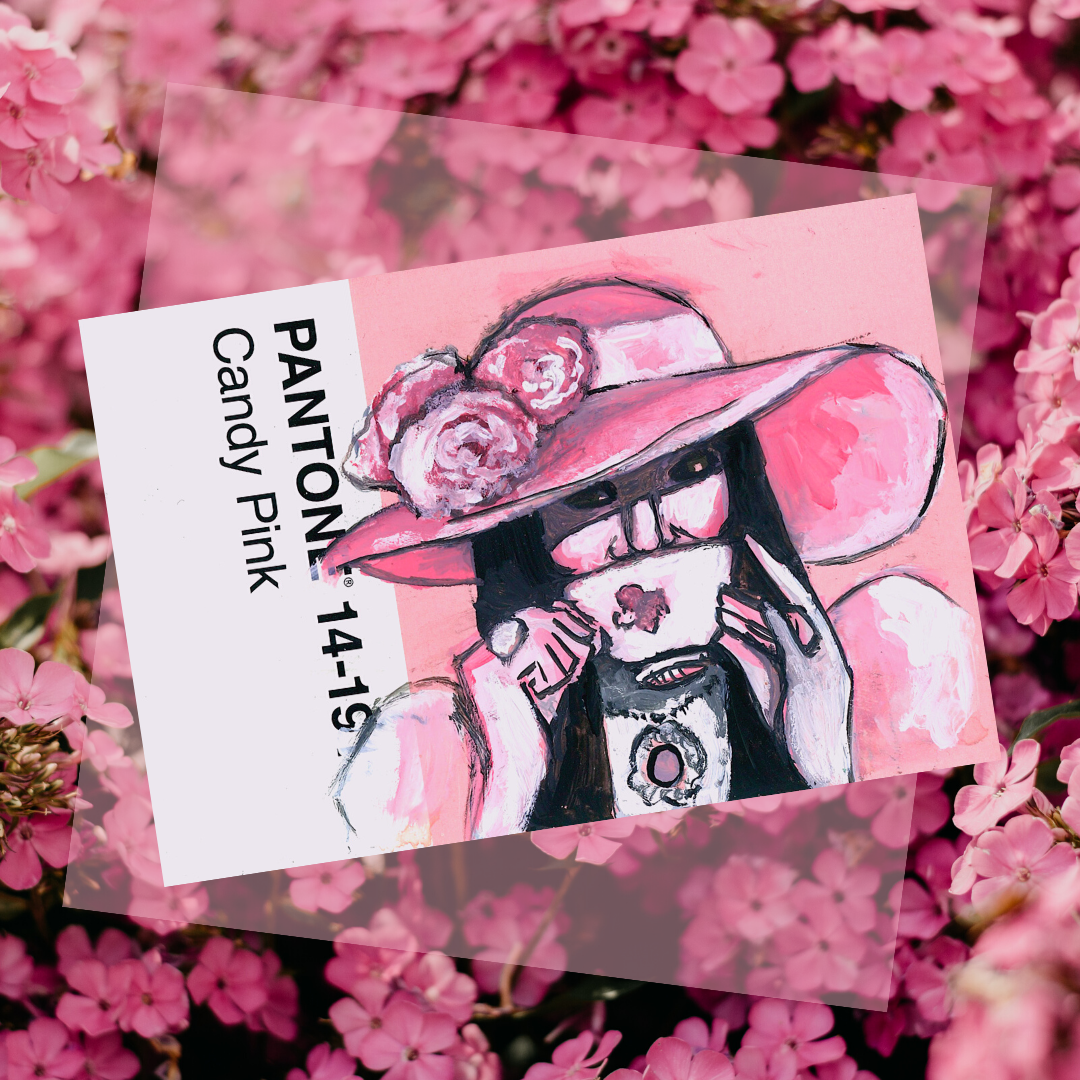
The Love Witch
The first of a new series, the piece above was inspired by The Love Witch (2016), a film whose use of color is highly stylized and saturated. In the scene reference above, pink is the absolute dominant color, which inspired me to paint it on the Pantone postcard for the shade “Candy Pink.” This inspired me to look to other films for powerful color motifs to reference.
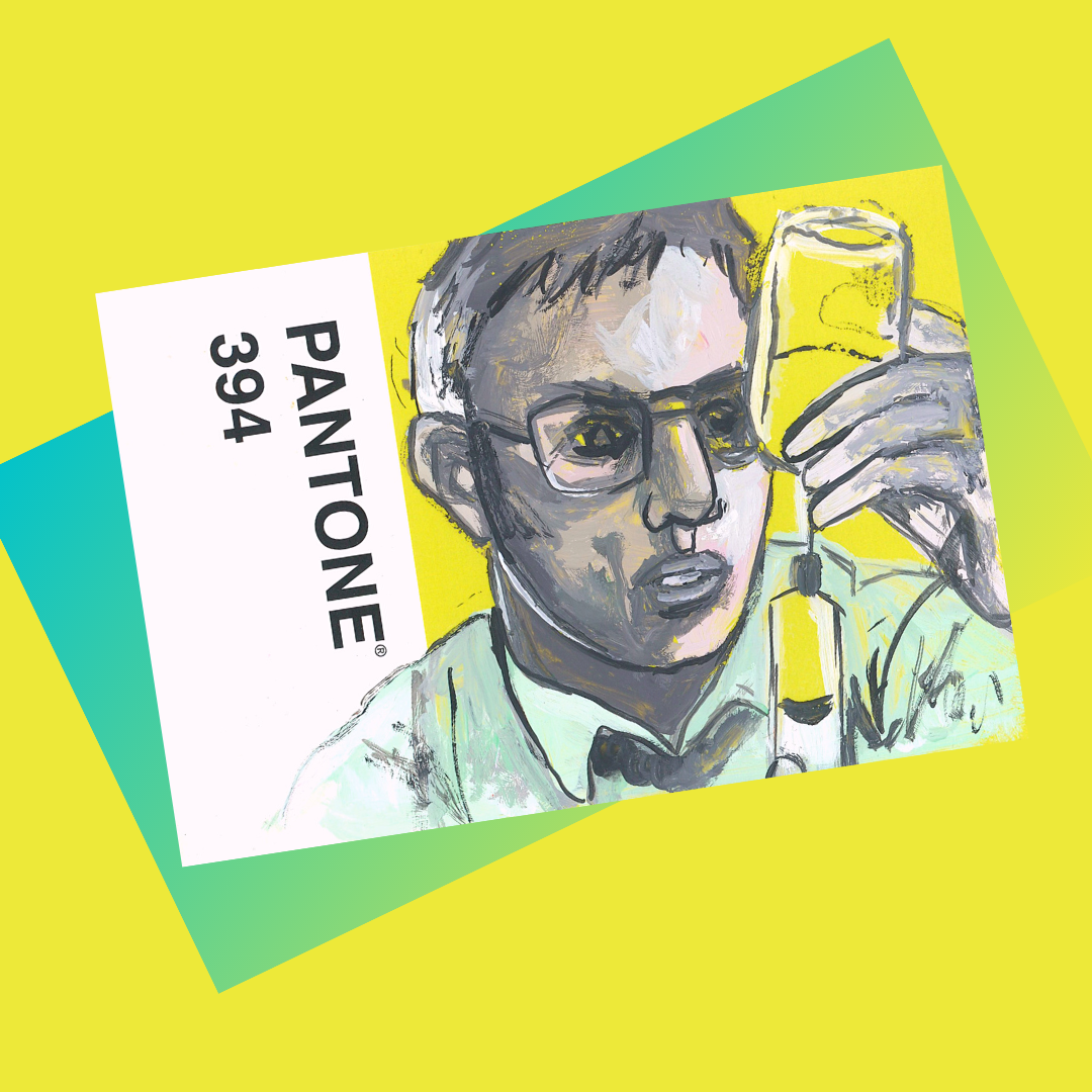
Re-Animator (1985) makes use of this sickly neon green color for its life-giving medical solution. Despite being contained in vials and needles it remains the dominant color of every frame it is in - the glowing FX making it look almost ethereal (or like a lot of highlighter fluid).
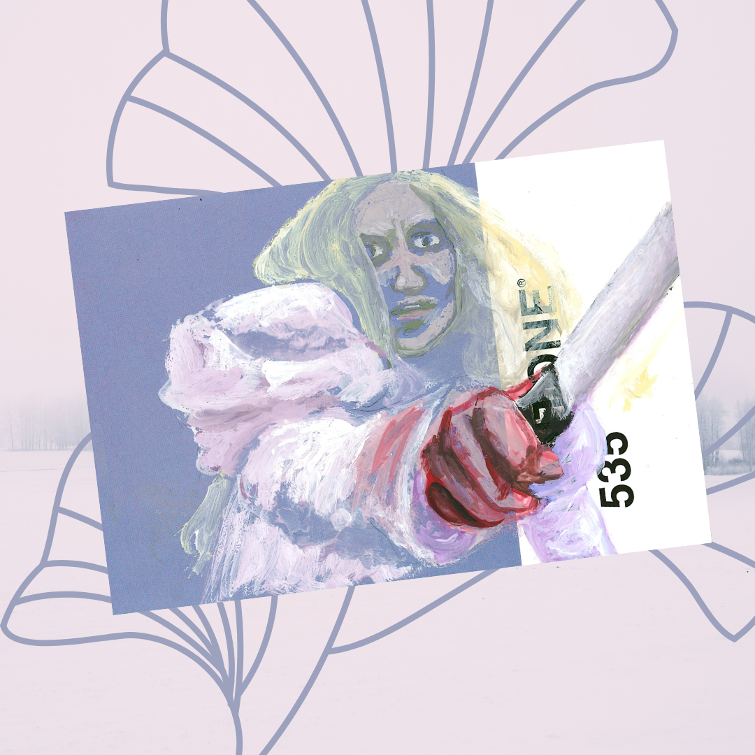
Crimson Peak (2015) has a lavender undertone for the entire last sequence of the movie, despite also having some dark blacks and reds. This contrast is referenced in this piece, which uses a purple Pantone shade to build the lavender and white shades of the shot.


